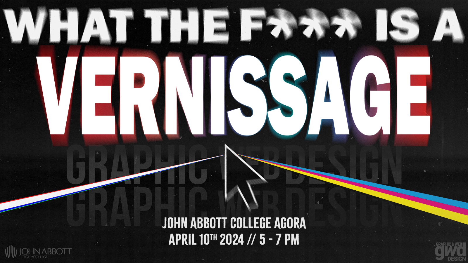
Vernissage?
So, what’s a vernissage? Basically, it’s a fancy term for a private viewing of artwork before they’re shown to the public. Our teachers chose it for our event, which makes sense because it’s like our first big moment to show off our graphic design work before we officially graduate.
But here’s the thing
We had to make posters to promote the event around campus. There was a little competition between all the third-year graphic design students, where each student would make a poster, then we would choose the best one to be displayed around the school. Spoiler alert, my poster didn’t win the competition— rightfully so, the person that won deserved it. (My poster is the picture above, multiple versions were made to promote on social media as well, this is the twitter version). My issue is not with the competition, it’s with the process. Teachers were very intent on naming it a vernissage and vernissage only. The problem I see in that is, when advertising is made for events or whatever, the audience should be considered. The audience in this case being students and staff around campus. Majority being students. With that fact in mind, no student knows what a vernissage is. I asked about 10 people, (some friends, co-workers, older people), 0/10 knew what it was, 2/10 kind of had an idea but weren’t sure.
T’was Fun!
Now, I get the whole fancy vibe the word gives off, but for the posters, it would’ve been better to use simpler language. Stuff like “design expo,” “art exhibit,” or “art expo” would’ve made more sense to the students and staff who’d actually see them. It’s just that for the poster competition having the liberty of choosing different names would’ve allowed the designers for more versatility.
Anyways though. I had a great time at the actual vernissage. It was nice to dress up for a change, and seeing everyone’s artwork was pretty inspiring.
